Interactive Example
Appearance and Behavior
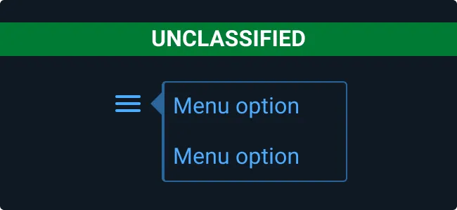
Usually hidden on load, a Pop Up is invoked by clicking an interactable element with a defined target area. To close a Pop Up, the user may click outside its bounds, click a dedicated close button, or select an option within.
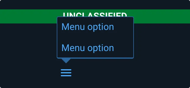
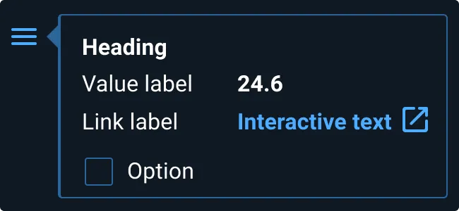
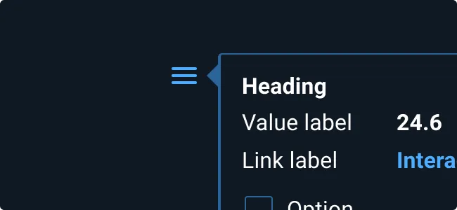
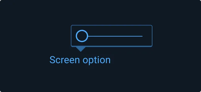
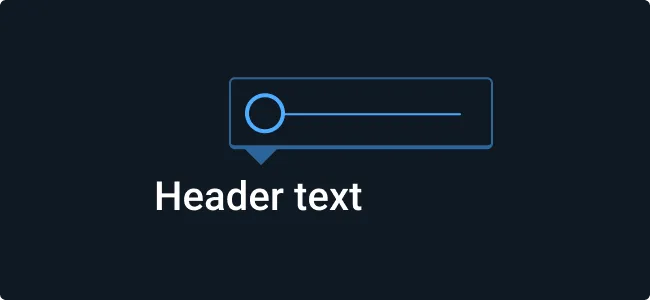
Anatomically, a Pop Up is comprised of a content container with an arrow protruding from its edge that always points at the item from which it was invoked. Depending on a variety of factors – such as the size of the Pop Up itself, the size of the display, and scrolled position of the window – the arrow’s location along the Pop Up’s edge is variable. The width of the Pop will be pre-defined and specific to its content.
In terms of placement screen, the entire Pop Up must always be visible and never exceed the window frame. Furthermore, it must never obscure other screen items that require persistent visibility (such as Classification Banners or Application States).
All interactable items (e.g. menu items, links, buttons, checkboxes) appearing within a Pop Up are displayed using the appropriate Astro color representing the unselected state. Color changes corresponding to hover, focus, and select actions all apply. Disabled items are indicated by reduced opacity.
Rules of Thumb
- Avoid loading the container with too many interactions or data.
- Aim to provide the user with a quick, easy to operate mechanism for executing focused, contextual actions.
- Don’t activate Pop Ups from Buttons.
- Keep explanatory text to a minimum. If more extensive instruction is required, consider providing a link to a dedicated help page.
- Use when you need to display information with formatting that a tooltip cannot provide.
Examples
Asset Status
| Asset | Version | Status |
|---|---|---|
| Documentation | N/A | Available |
| UI Kit - Dark | v7 | Available |
| UI Kit - Light | v7 | Available |
| UI Kit - Wireframe | v7 | Available |
| Web Component | v7 | Available |
| Component Tokens | N/A | Planned |