Anatomy
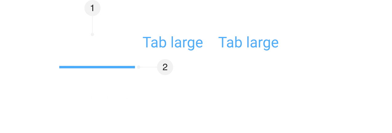
- Label
- Active Indicator
Default
| Attribute | Token | Value |
|---|---|---|
| Tab | ||
| Padding (Left and Right) | tab-padding-x-large | |
| Padding | tab-padding-top-large | |
| Padding | tab-padding-bottom-large | |
| Border Width | tab-border-width-bottom | |
| Label | ||
| Text Color | tab-color-text-default | |
| Font Size | font-heading-2-font-size | |
| Font Family | font-heading-2-font-family | |
| Font Weight | font-heading-2-font-weight | |
| Line Height | font-heading-2-line-height | |
| Letter Spacing | font-heading-2-letter-spacing | |
| Body | ||
| Padding | card-body-padding |
Sizes


Small
| Attribute | Token | Value |
|---|---|---|
| Tab | ||
| Padding (Left and Right) | tab-padding-x-small | |
| Padding | tab-padding-top-small | |
| Padding | tab-padding-bottom-small |
Large
| Attribute | Token | Value |
|---|---|---|
| Tab | ||
| Padding (Left and Right) | tab-padding-x-large | |
| Padding | tab-padding-top-large | |
| Padding | tab-padding-bottom-large |
States


Default
| Attribute | Token | Value |
|---|---|---|
| Tab | ||
| Text Color | tab-color-text-default |
Hover
| Attribute | Token | Value |
|---|---|---|
| Tab | ||
| Text Color | tab-color-text-hover |
Selected
| Attribute | Token | Value |
|---|---|---|
| Header | ||
| Text Color | tab-color-text-selected | |
| Border Color | tab-color-border-bottom-selected |
Disabled
| Attribute | Token | Value |
|---|---|---|
| Tab | ||
| Opacity | opacity-disabled |
Focus
| Attribute | Token | Value |
|---|---|---|
| Tab | ||
| Outline Offset | spacing-focus-default | |
| Outline | color-border-focus-default |